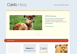
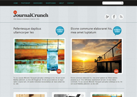
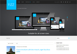
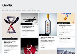
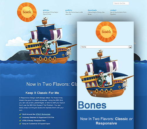
The Responsive version of Bones is that starting point. With a stylesheet setup for media queries and a Mobile First approach, you’ll already be ahead of the curve.
Premium Responsive WordPress Theme for Free Download
Website Details
- Category
- Free Wordpress Themes
- Published
- June 16, 2012