 by
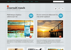
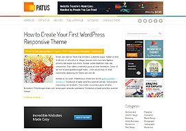
by Yasmin is a responsive wordpress theme. That means the theme will adjust itself to the screen size of various devices used to browse the web. Let that be your desktop, laptop, tablet or even your smart phone. You will not have to swipe and drag to see the content overflowing your small screen sized devices. It is not only the site layout that is responsive, even the media elements like images, slideshows and videos are responsive in this theme. This is based on the skeleton Framework.
